available to purchase here.
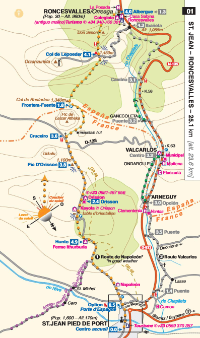
When chatting about guides and maps to the Camino, John Brierley’s A Pilgrim’s Guide is often spoken of approvingly, particularly for its maps. Indeed, a separate smaller maps-only versions of his guide to the Camino Francés and Camino Portugués are also available. Part of the reason they are so successful is that they follow a design principle found in many medieval maps – they are hodological, rather than cartographic.
What do I mean? Well let’s start with cartographic maps, which we take as a default. These have three common characteristics. Firstly, they are usually orientated with north at the top of the page, second they are usually to a fixed scale (e.g. 1cm = 1km), and third they are comprehensive (e.g. they include every road). Although we take these characteristics as a given, they are simply inventions and conventions, and measured by these standards, Brierley’s maps fare poorly. Let’s take the example of his Map No 2 (covering 21.9km between Roncesvalles and Zubiri) and No. 25 (covering 30.6km between Molinaseca and Villafranca). Firstly, the exact same size page, without a scale, is used for covering distances that differ by 8.7km. Secondly, the orientation differs – north in No.2 is at 4 o’clock, but it is at 2 o’clock in No. 25. Thirdly, both maps are blank where a number of small settlements should be inserted. But for a peregrino Brierley’s maps are superior. Why? Because they follow a common medieval principle, they were not conceived of in cartographic terms but rather in hodological terms.
Hodos is Greek for a ‘path’ and that’s what his maps do, they outline the route that one would take in a day. Many medieval maps do likewise, especially pilgrim maps. The aim was to help you get from A to B, not to inform you about C to Z on your right or left. As many of you who have used Camino maps that are simply overlays onto cartographic maps will know, they quickly become confusing. Maps, like the pioneer of graphic design Edward Tufte suggested of charts, should give the maximum amount of information for the minimum amount of ink. The average medieval pilgrim map, like that of thirteenth-century Matthew Paris, gave you the route in daily sections – the English word ‘journey’ is from medieval French meaning a day’s travel. You will already be familiar with the hodological mapping principle if you have ever used an underground rail map (like the Tube in London, or Metro in Madrid or Paris). You will know that it bears a limited resemblance to the surface, but is perfectly useful and indeed superior to a cartographic map for getting you from A to B.
All we need to do now is stop focusing on the maps – paper or Google – and take a look at what’s around us.

2 thoughts on “Medieval Mapping – a superior technique for a modern pilgrim?”